Usability Testing for Code Championship
Usability Testing for Code Championship
Challenge
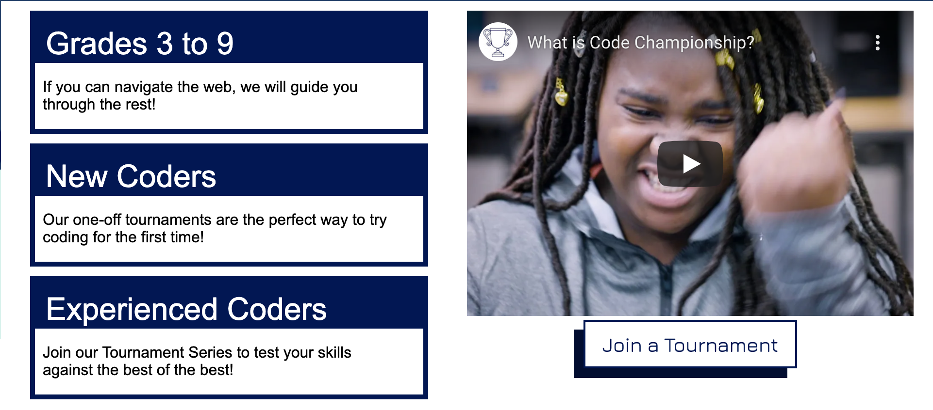
Code Championship brings coding tournaments to Minnesota students grades 3-9. The organization’s website serves students who want to practice coding, parents who want to find out about the organization, and teachers who want to host their own tournaments. Our design team conducted usability testing in response to concerns that the site was impeding engagement
Recommendations
I recommended bolstering the consistency and minimalism of the site design, as well as surfacing info that users wanted most--who runs the organization, what tournaments are like, and who can participate.
My Role
For this project, I worked as part of a team of 5. My role included:
• Completing usability review
• Collaborating on research protocol and
usability testing script
• Recruiting participants for usability testing
• Leading usability interviews
• Research synthesis
• Creating findings & recommendations
Tools
- InVision Whiteboard
- Zoom
- Data spreadsheets
- Otter app (for trancriptions)
- Usability Test Protocol and Script
- Keynote
Methods
- Usability Review
- Remote moderated interviews
- Think aloud protocol
- Affinity diagramming
Usability Review
Drawing on Nielsen’s usability heuristics, I classified a number of usability issues with the site. Issues centered on the site’s aesthetics, its match with the world, its consistency, and the degree to which it offered visibility relative to processes.
Aesthetics--minimalism
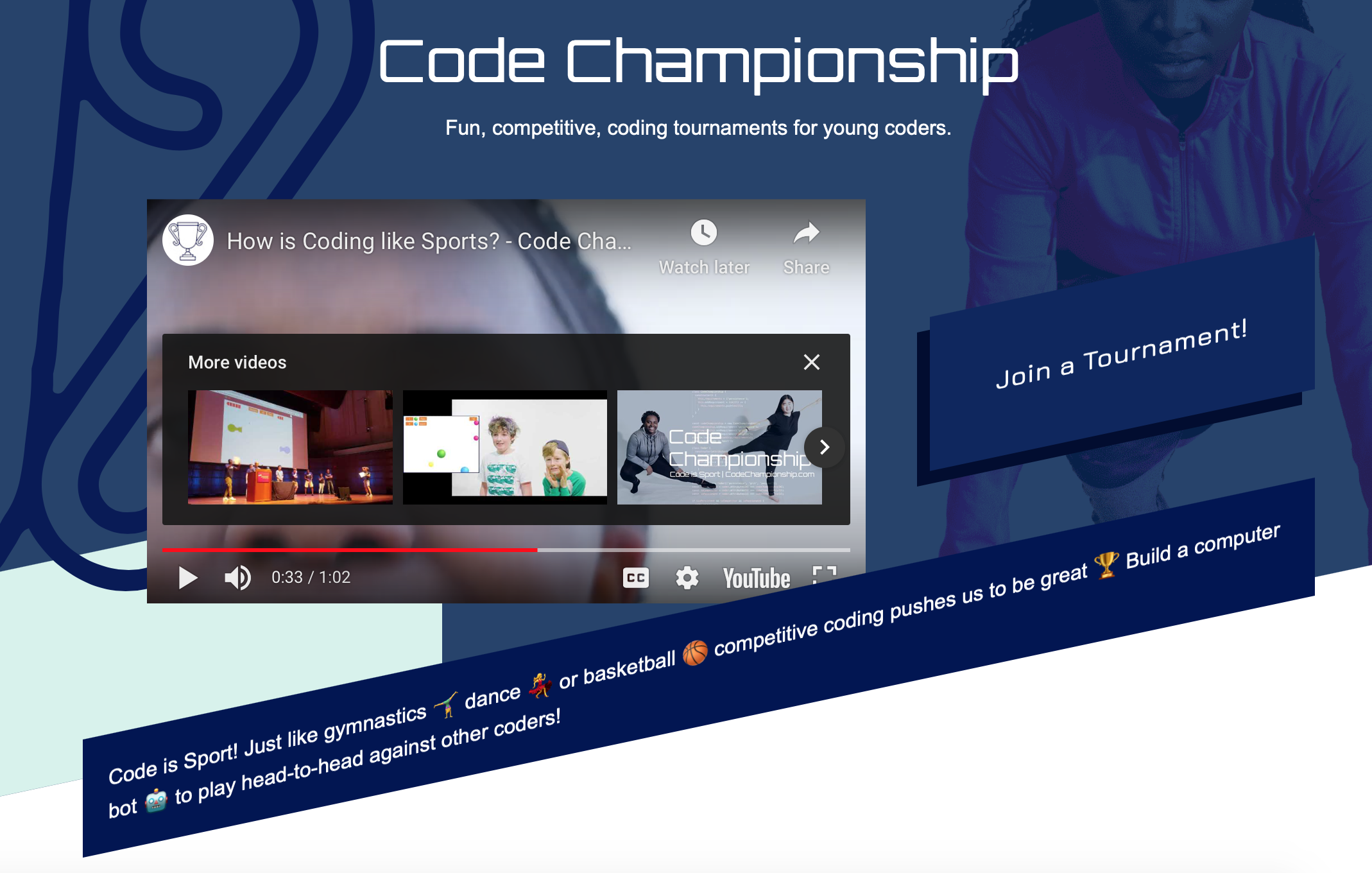
Much of the site featured banners and buttons on the bias. Visually disruptive, the motif also made it difficult to distinguish between buttons and fixed elements.
Match with the world
The site’s on-the-bias buttons are unlike those of most other sites. Users would likely have to think about whether they’re clickable before trying.

Consistency
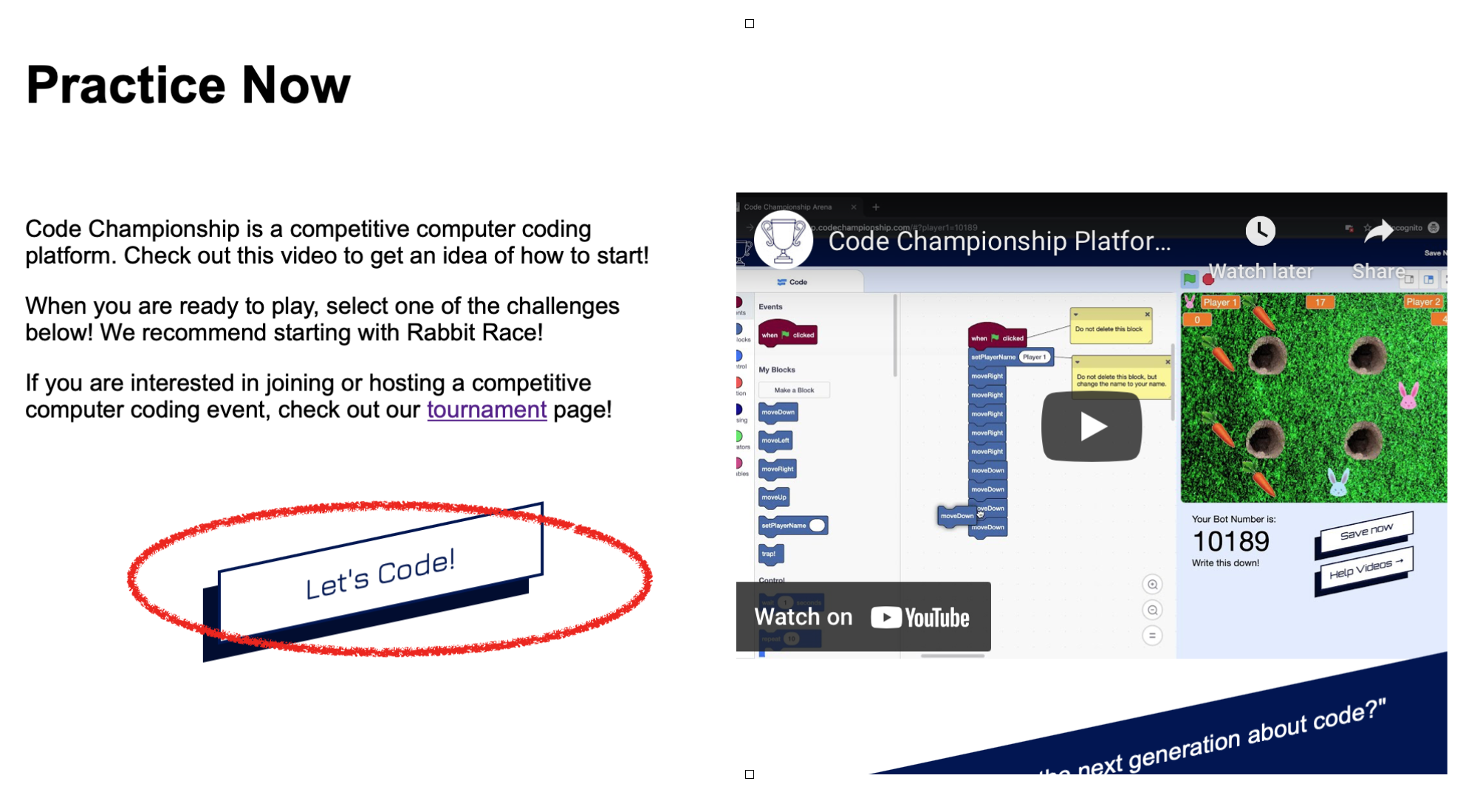
The site used inconsistent language to refer to the same actions. In one example, three different calls to action encouraged students to practice coding, creating confusion about the purpose of the practice page and reducing its findability.
The site used inconsistent language to refer to the same actions. In one example, three different calls to action encouraged students to practice coding, creating confusion about the purpose of the practice page and reducing its findability.

Visibility
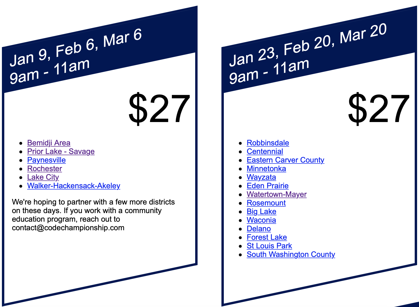
Visibility issues affected registration and payment processes. To register for tournaments users first clicked on cities, then were led to an external site to complete registration. The site did not warn users that they would be leaving the Code Championship site.
In addition to the heuristics issues, more organic concerns about the site’s content arose, especially regarding Code Championship’s mission and identity. For instance, there was no About tab and users had to scroll to the bottom of a very long home page to learn about Code Championship. Even then there was no mention of the organization’s personnel or institutional partners.
Discover the full usability review here.
 .
. 
Usability Testing
To build on these findings, my team and I organized usability interviews with parents, teachers and kids. We created a research protocol and script, recruited study participants, and conducted interviews. We asked participants to talk through their expectations and impressions aloud as they tried to complete tasks related to their status as either parent, teacher or student.
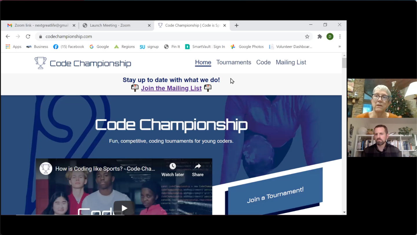
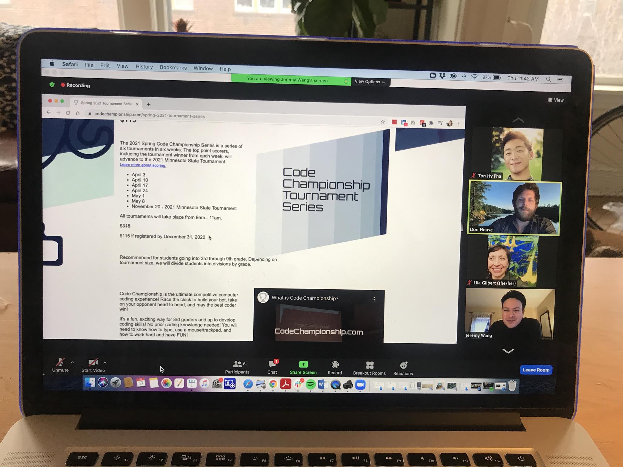
In all, we interviewed 16 users (9 60-minute interviews plus 7 additional 25-minute interviews).
Synthesis & Findings
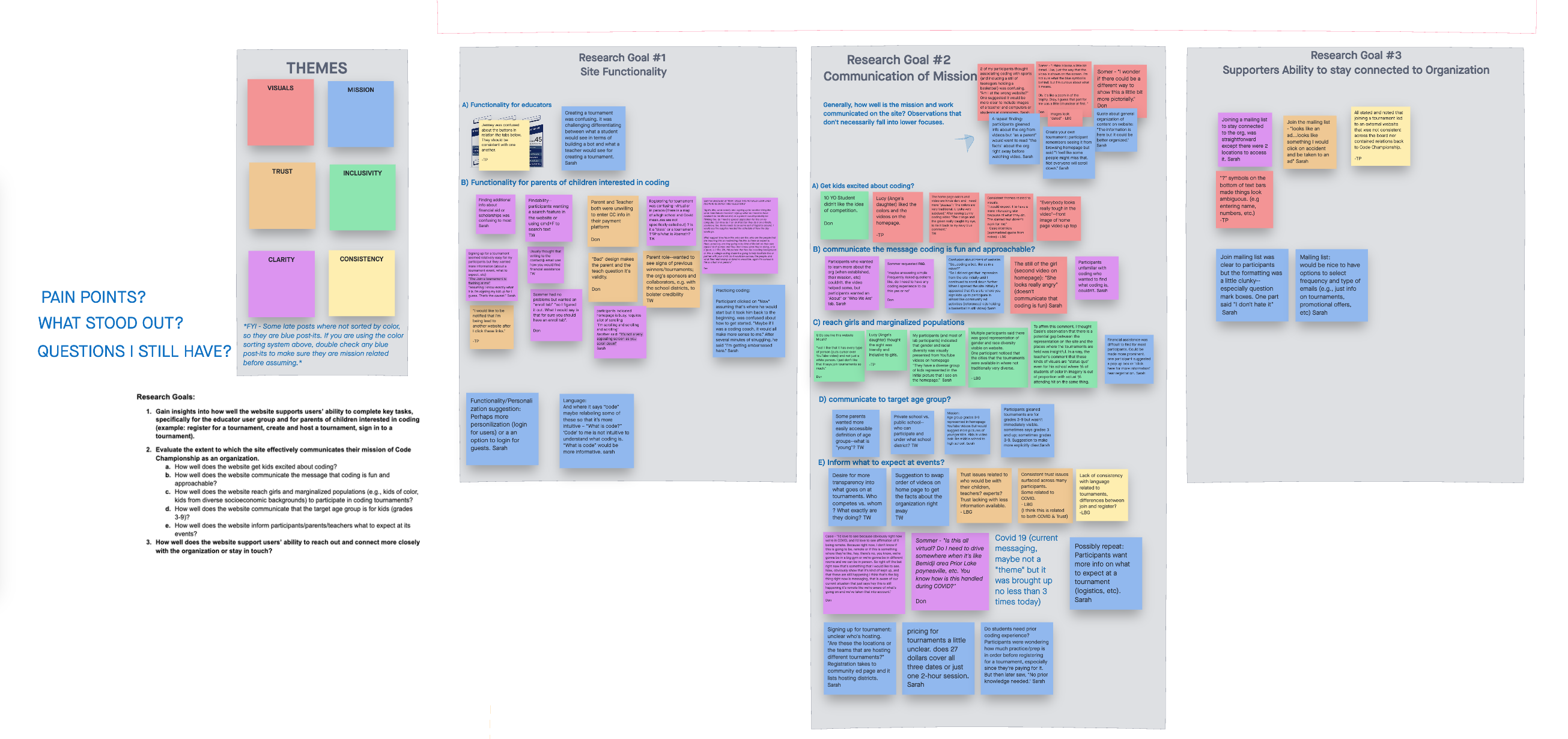
Our study participants confirmed many of the usability themes highlighted during the initial usability review. As the team began synthesizing our findings, a meta-theme related to “trust” emerged.
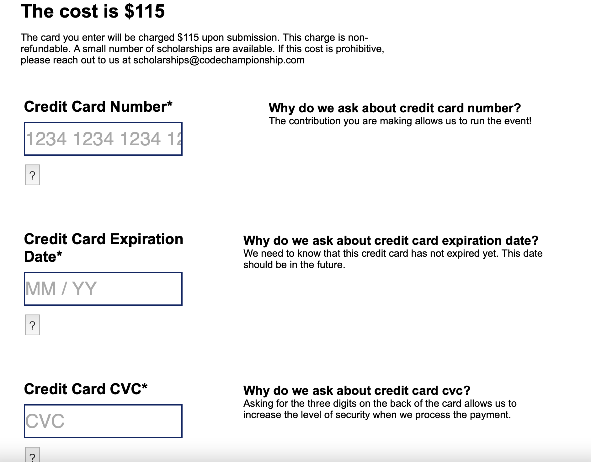
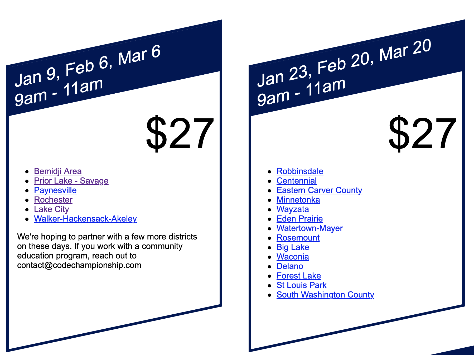
Parents’ trust in the organization was undermined by interface elements that did not correspond to consistency & world-matching heuristics.
Apparent discrepancies in prices and this non-standard payment entry screen raised suspicions. Additionally, this screen invites parents to message a special address for scholarship information, but the visibility of this option is minimal.

Testimonials like this banner boosted the organization’s credibility, but parents and teachers still wanted to know more about who was involved with the tournaments and what they are like. We recommended creating an About page, detailing how the tournaments work, and giving prominent billing to the eligible age ranges.
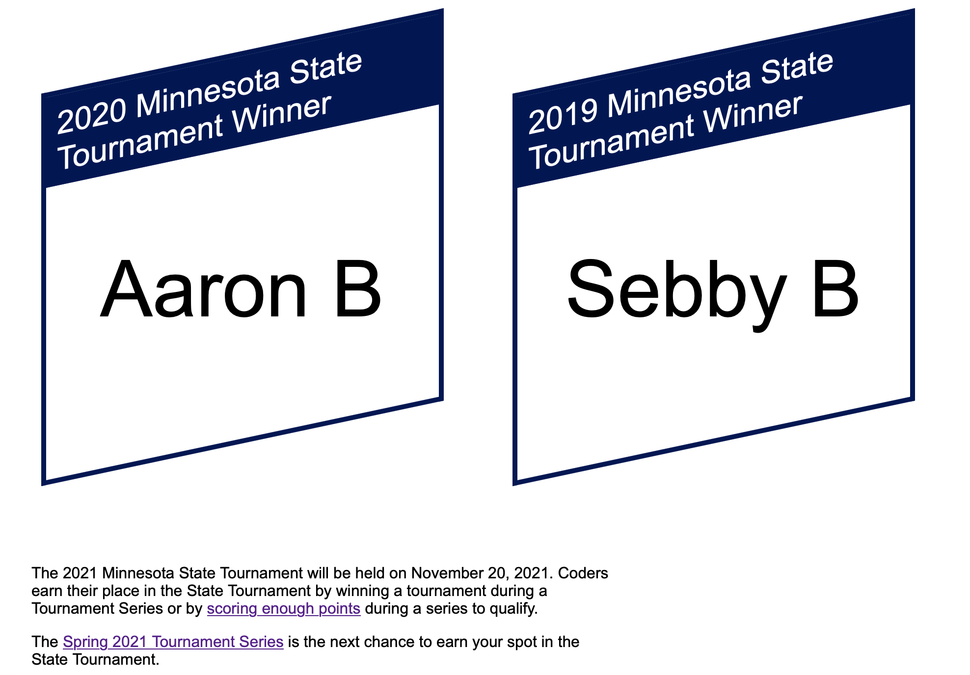
This was the only call-out of previous tournament winners on the site. Participants wanted to know more about who had won and how.
“Is this their first year? It looks like they have winners from the past. Is it virtual? Who are the other people who are competing? Make me feel that this is of a high caliber by saying maybe last year’s winners or what you get for being in this thing. What’s the ultimate point of this?” (User 8, Parent)
Highlighting the tournament’s history emerge as another way to bolster its credibility. We recommended honoring past winners and calling attention to the school districts where tournaments had been held.
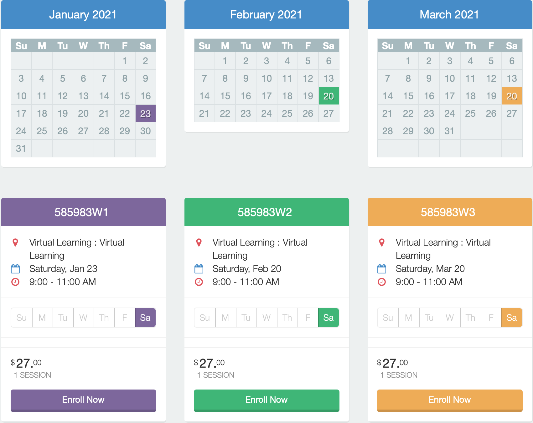
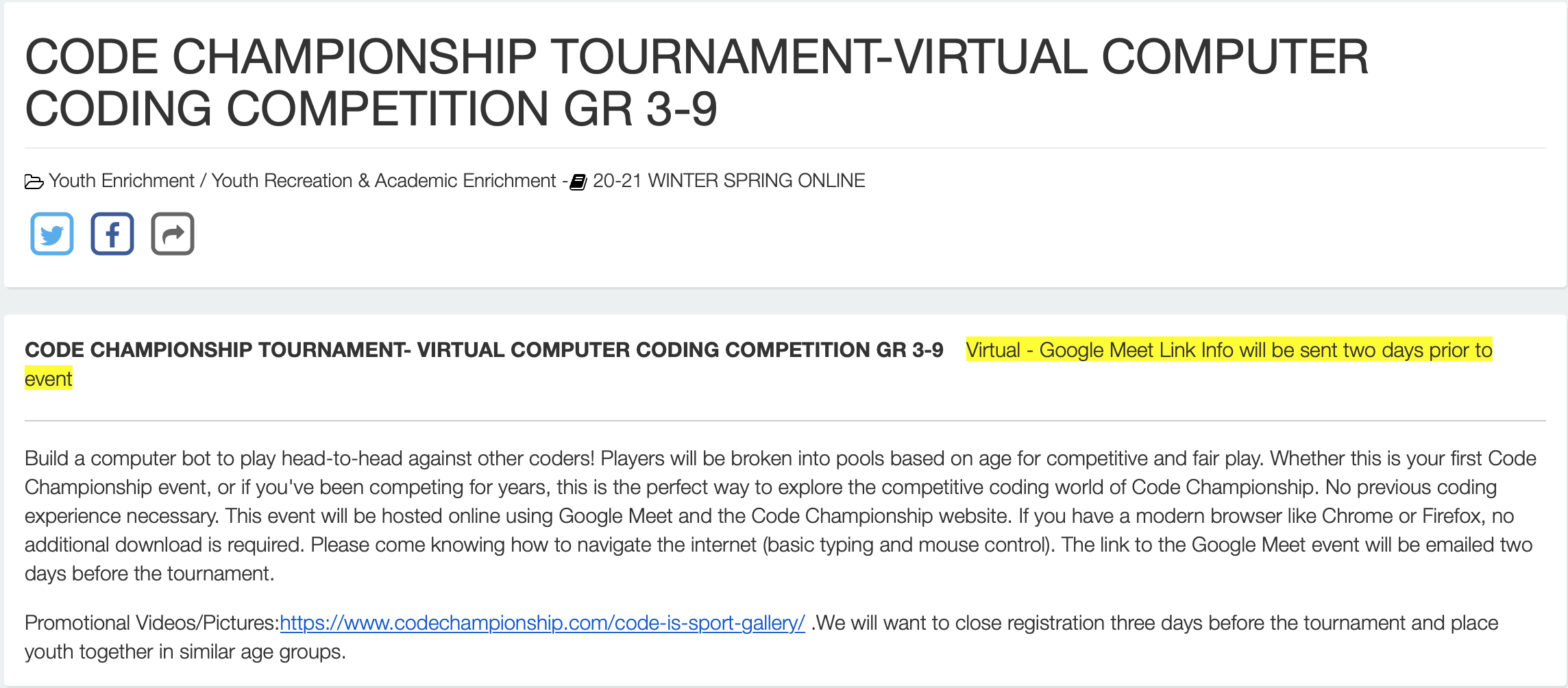
The participant interviews were conducted in December 2020, but the site did not acknowledge Covid anywhere or specify that scheduled tournaments would be virtual. Parents and teachers wanted clear messaging around the organization’s Covid plans.
Discover the full findings & recommendations report here.
Project Highlights
During usability testing, my team nominated me to lead off user interviews--a meaningful vote of confidence.
Since we completed the project, the client has implemented most of our recommendations. See the new & improved site here.